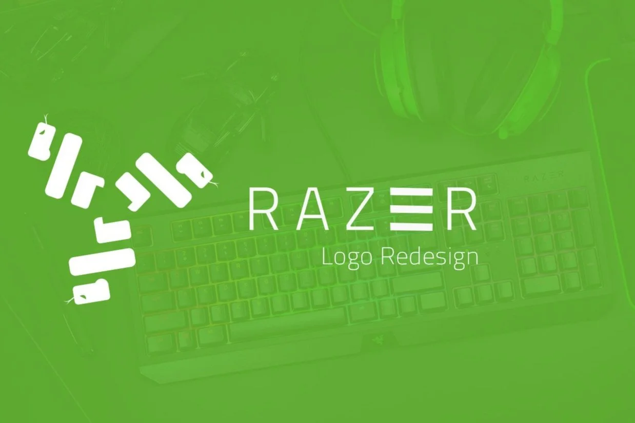
Razer Logo Redesign
Case Study
2022
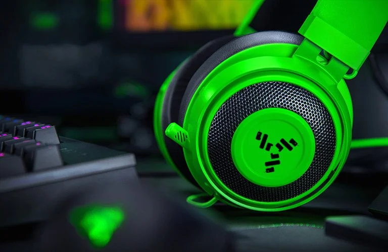
Razer
Role: Designer
Deliverables:
Logo Redesign
Brand Identity
Razer is one of the largest brands when it comes to video game hardware & accessories. Founded in 1998 Razer has gone through two iterations of its logo the first one was used from 1998 - 2016 and the second logo was done in 2016 - present. Although I do like their current logo and as a gamer, I am a massive fan of their products but there are a few improvements I think could be made, this is why I chose Razer for a rebrand.
Min-Liang Tan one of Razers founders once stated that the company name “Razer” would have been known as “Razor” if he didn’t disable his spellcheck while preparing the paperwork for the company, he goes on to say that the co-founder Robert Krakoff once had an accident with a razor blade which was very memorable to them and thus the name of the company was inspired by this event.
They have also stated that their first mouse product looked like it ate a Logitech mouse so they named it the Razer Boomslang after the boomslang snake which is what their logo and brand colors were inspired by.
My Creative Process
I first made a mood board for this rebranding, gathering Razer’s old logo, images of snakes which is what the logo is inspired by, as well as razors because of the story the co-founder had which involved an accident with a razor blade, and finally Razers competition and their logo’s as well as some snake vectors to draw inspiration from.
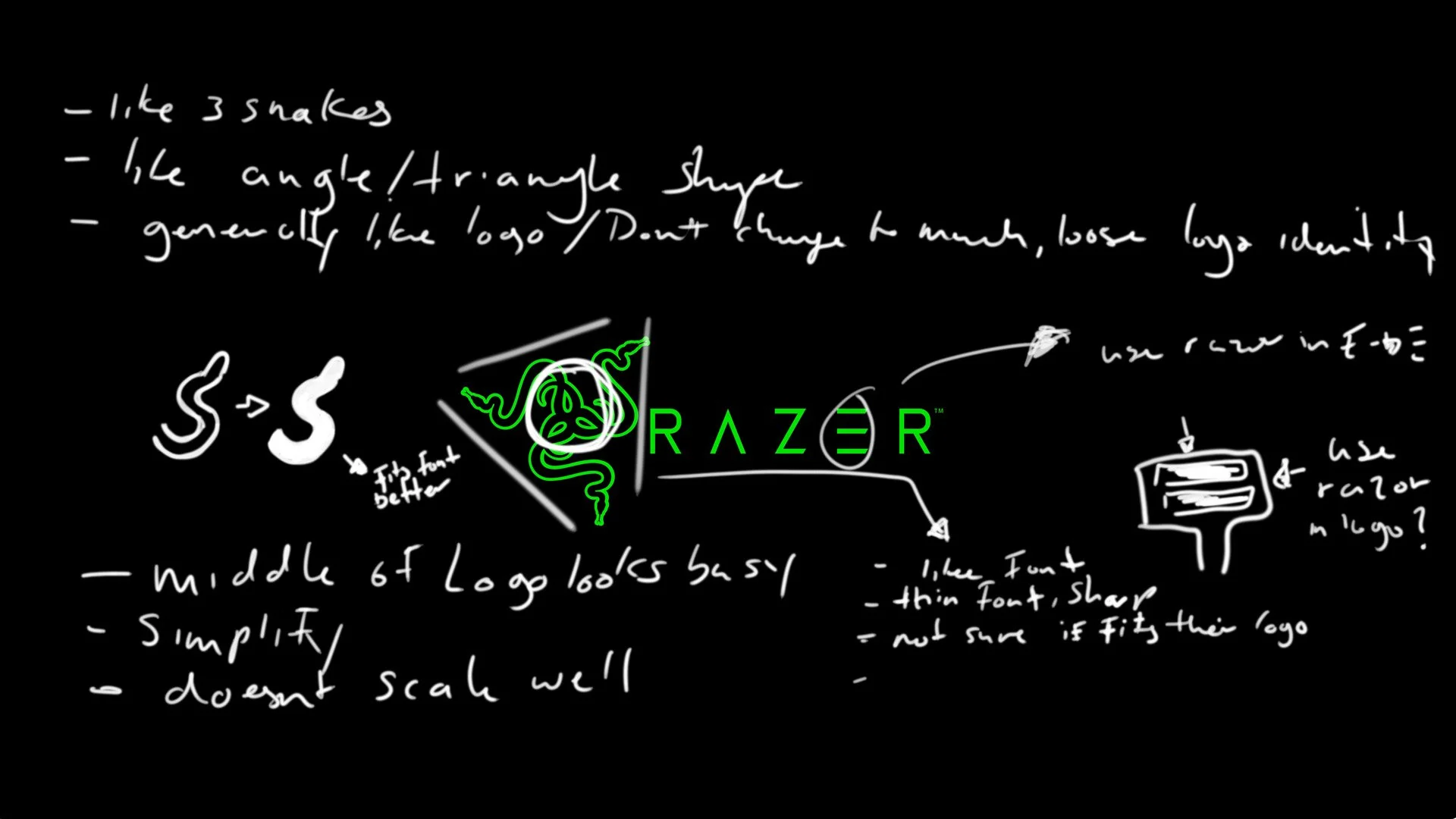
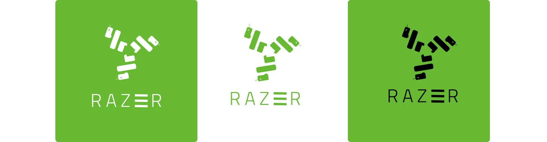
First I analyzed their logo and made notes of things I liked and things I wanted to change ( such as keeping the 3 snake imagery, keeping them on an angle to form a triangle, and keeping the font similar.) ( Then changing the middle of their logo as it looks very busy, and changing the snakes from outlines to a solid shape as both the middle and the outline shapes don’t scale very well and looks messy as it scales down.)
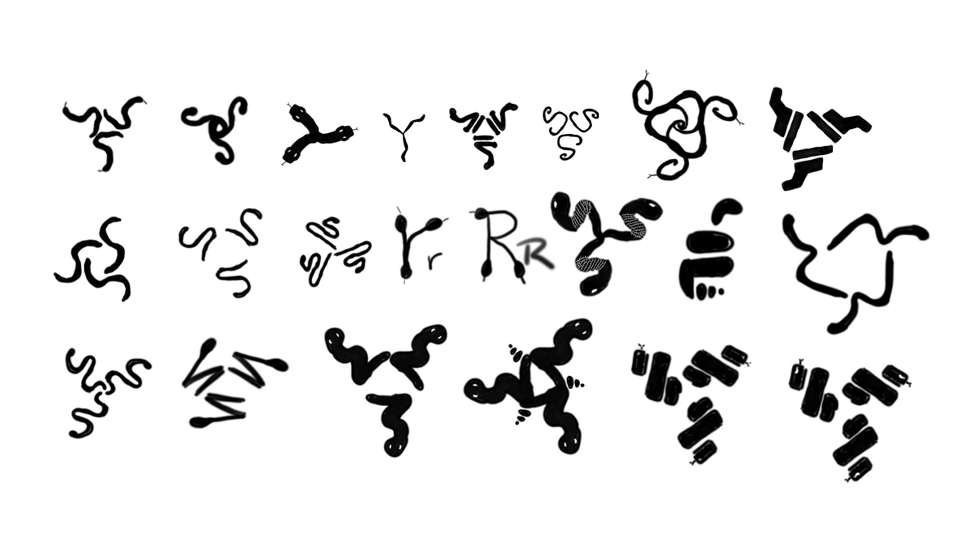
I then did some rough sketches of the logo in photoshop, I knew I didn’t want the brand to lose its identity so I wanted to keep the imagery of three snakes and I liked how they looked on an angle to form a sort of triangle.
I then settled on the last sketch as I thought it fit my redesign goals the best ( no outlines, no busy middle area, and to form the snake I used 3 bars, kind of symbolizing a razor blade.)
Colour & Font
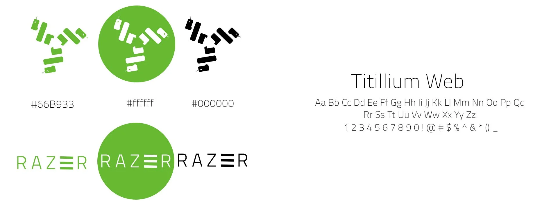
I chose to keep the font as well as the colours the same as I didn’t see any issues with them.